At Publicis Groupe Belgium, I have been commissioned to create the identity of their new Instagram account. In order to guarantee a young and modern image for BNP Paribas Fortis Private Banking on Instagram, I came up with two main principles that must be respected at all times.
1. Iconography
Private Banking iconography is based on the regular BNPPF style.
Realistic situations showing real people in a natural context and pose.
Positivity, wealth, bright, impact are the keywords.


2. The Colours
Modern, fresh and impactful gradients for immediate brand recognition will be used in each post.


4 templates for the feed
Depending on the theme and content of the post, there is 4 templates to choose from.
Each canvas uses a colour gradient that reinforces the identity of BNP Paribas Fortis Private Banking.


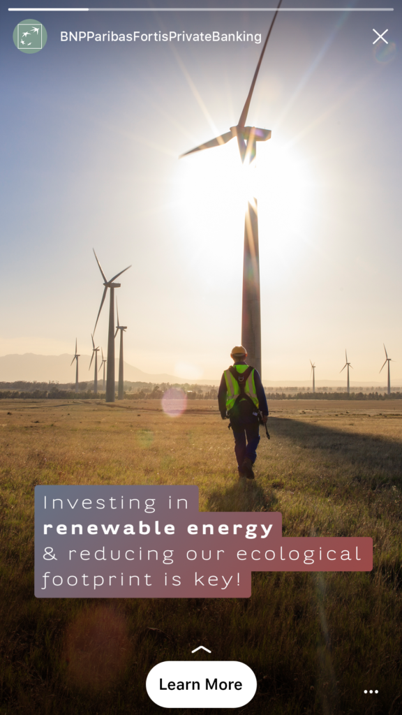
3 Templates for stories
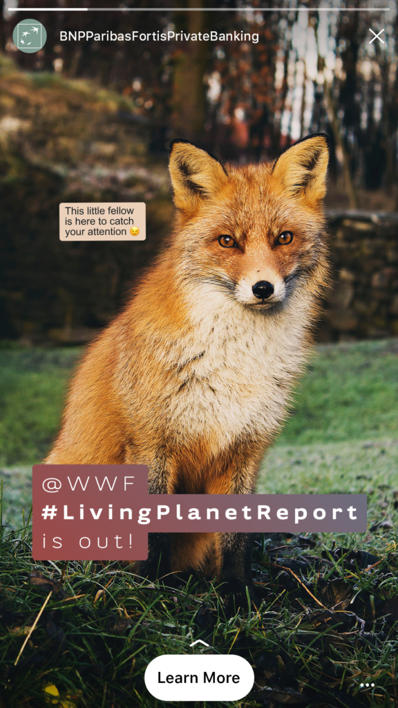
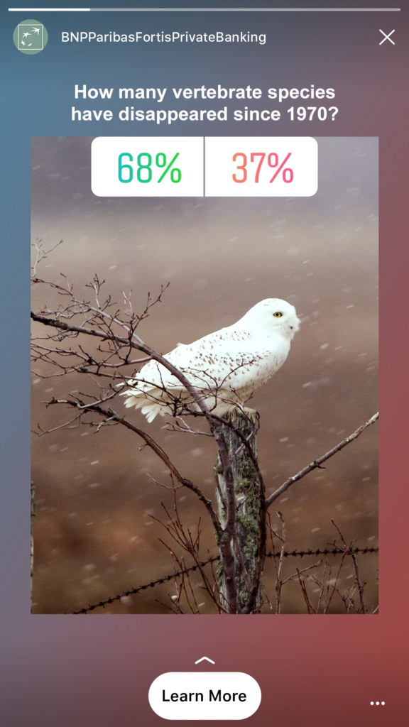
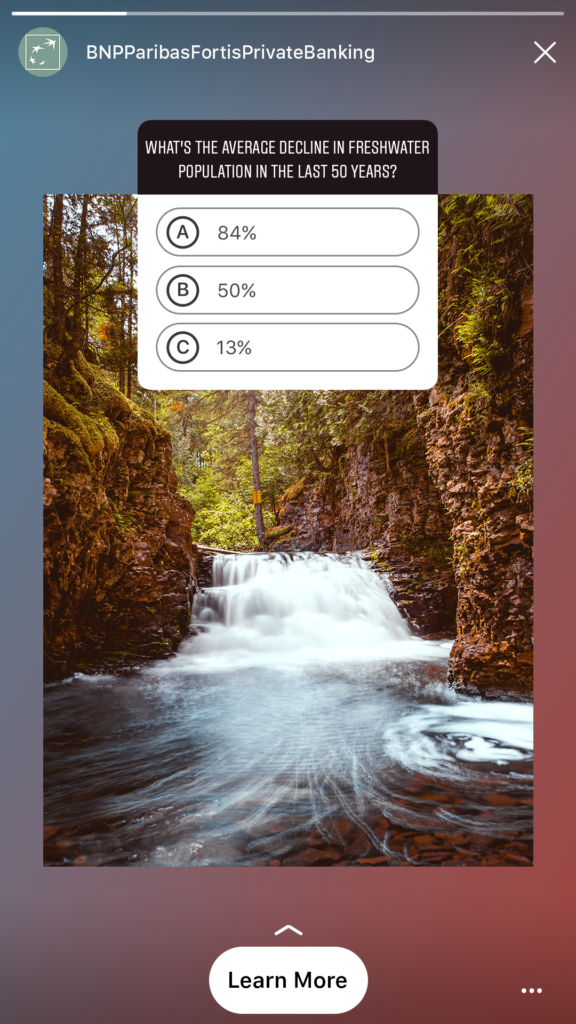
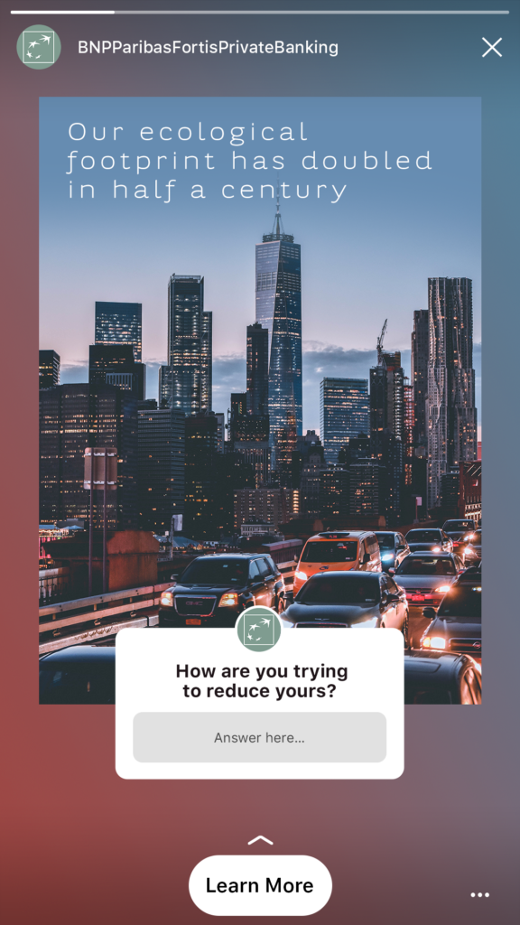
Following the same visual and graphic principles, any one of the following 3 templates can be used to build your stories.
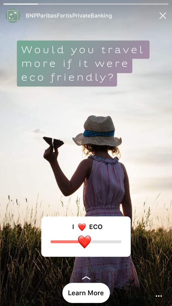
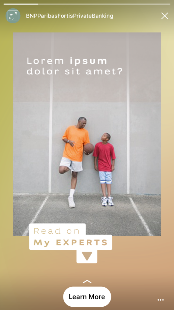
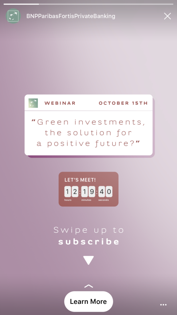
Gradients colouring the feed
The use of gradients follows a logical progression over time. Each gradient is used for a minimum of 6 posts.
To ensure a smooth transition between the two series, a specific gradient is chosen for a subsequent series.
The letter P will only be used once per series of 6 posts. There is no obligation to use it.

Examples with copy
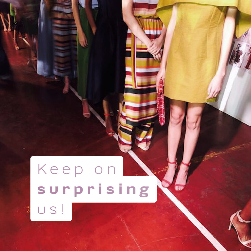
All gradients can be used as a text box or as the title. And should be chosen according the colours of the visual. The gradients are framed in order to fill the entire surface. They should be oriented in a way that best suits the visual content of the post.


Examples with gradient frame
All gradients can be used as photo borders. The gradients are framed to cover the entire surface.
Feed posts do not display text on the visual, while stories can be printed with simple text or on a background, depending on the need.


Graphic posts & stories examples

Carousel stories
