When Orange decided to launch a B-brand in Belgium, they asked us, at Publicis Groupe Belgium, to think about different names. And in the same time to propose their respective logo and visual identity. Once the name and logo was chosen, I come up with a complete visual identity for print, digital and social media, for statics and animations. With a single word in mind: simplicity. As simple as hey!

Colors
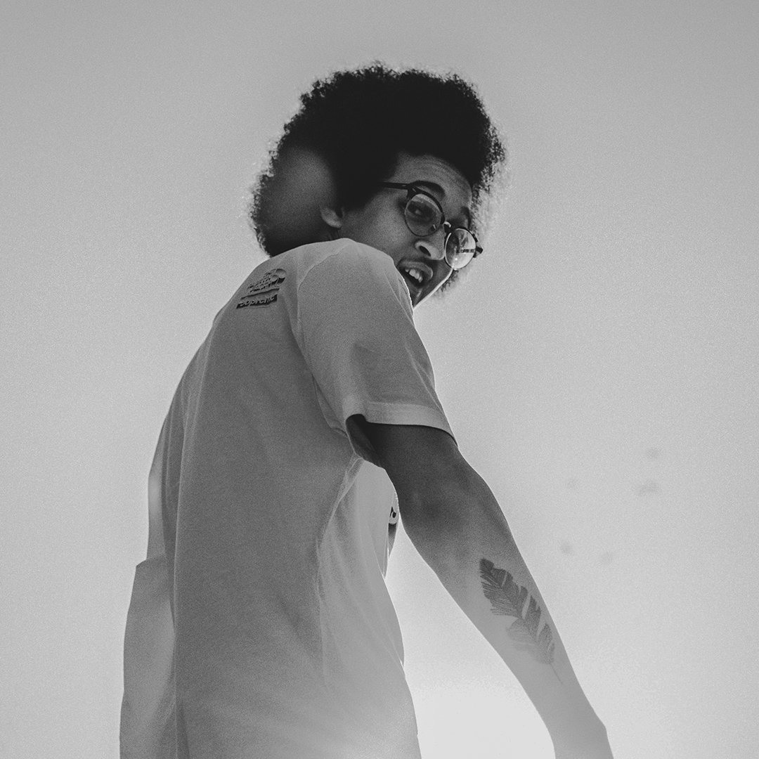
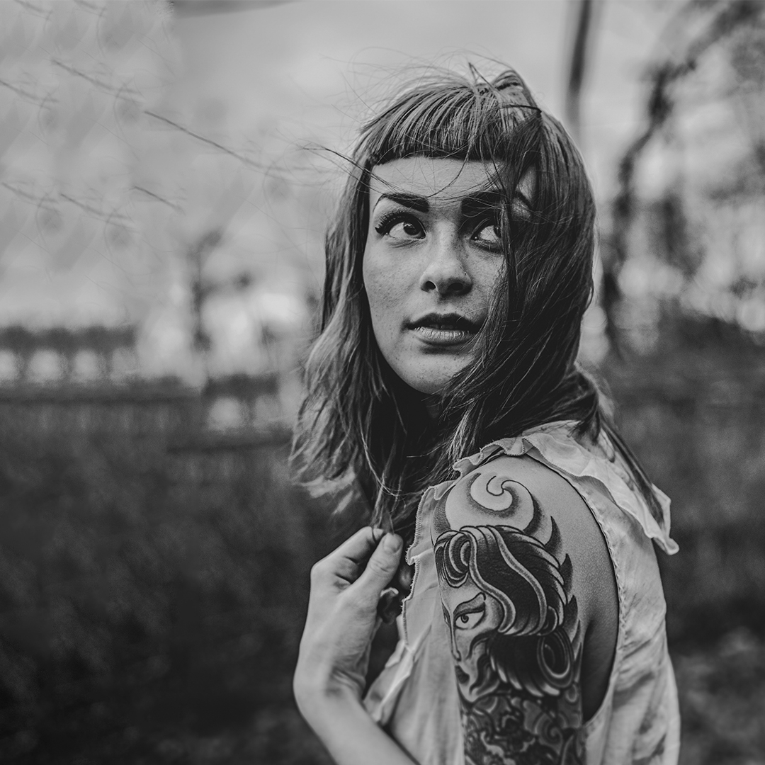
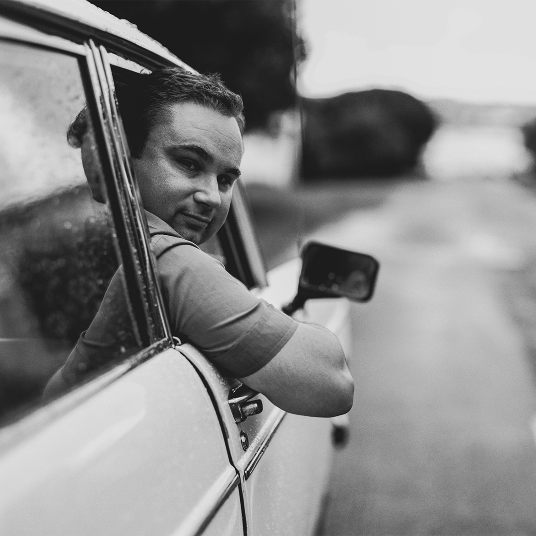
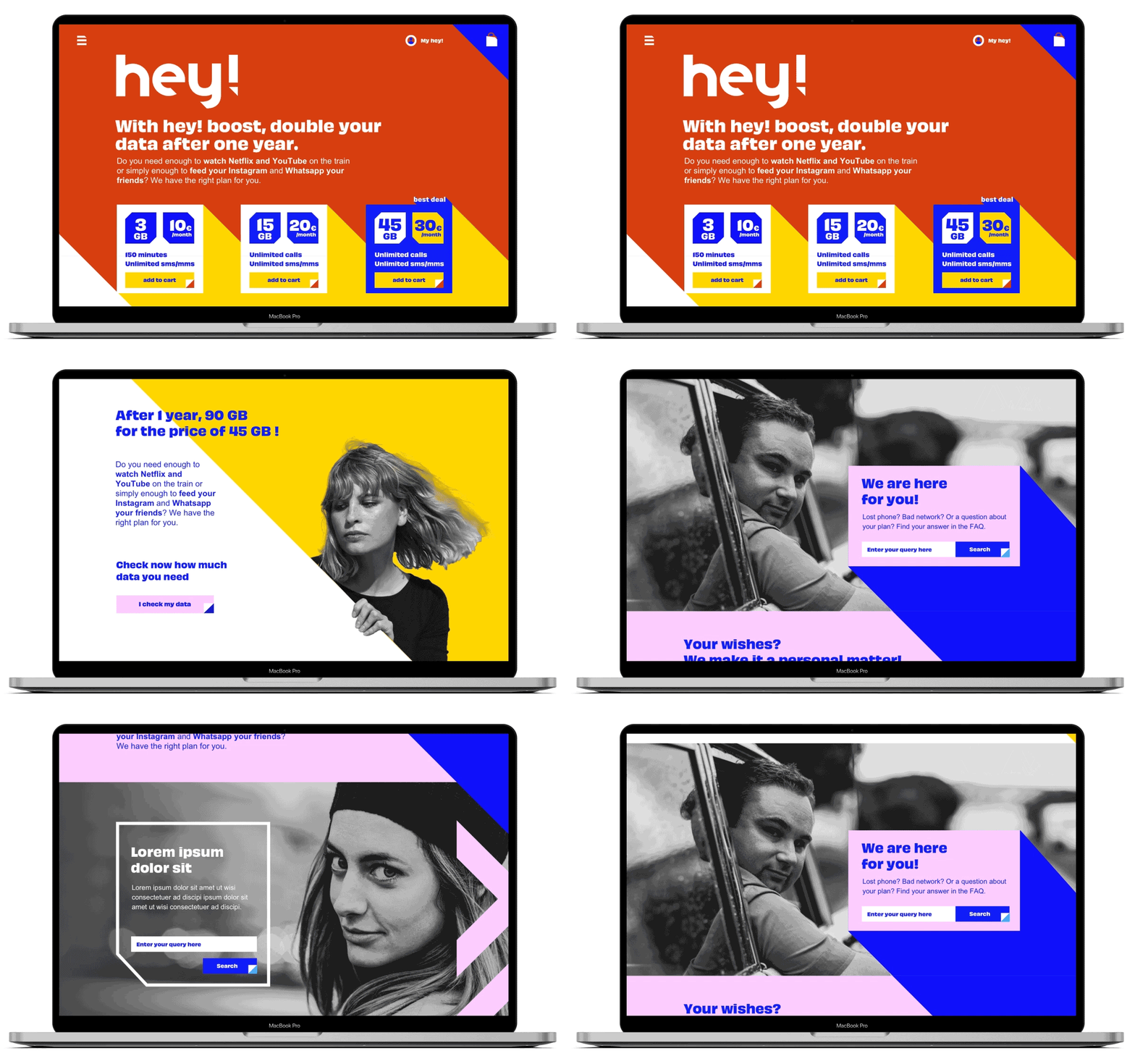
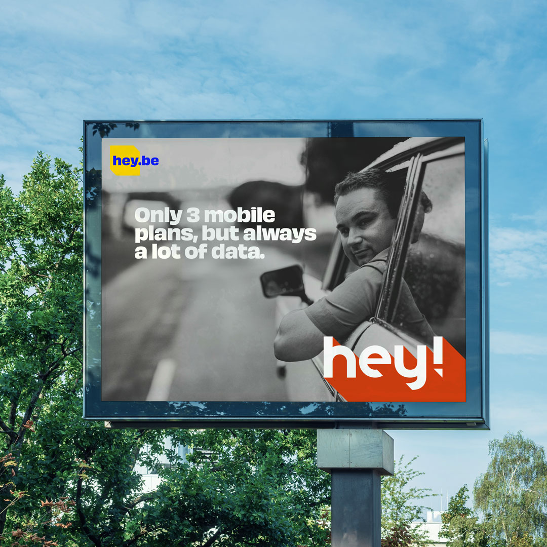
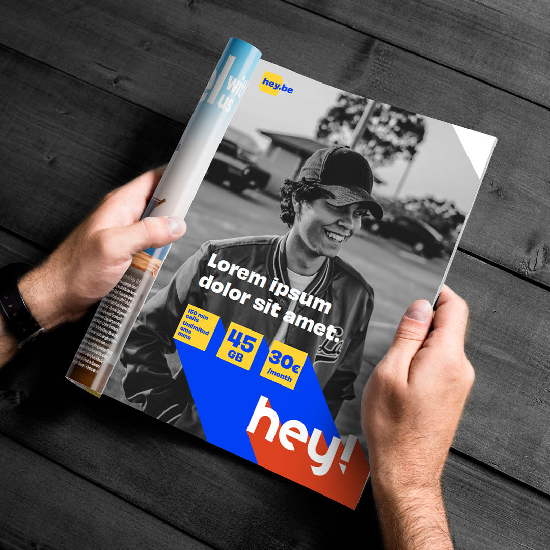
The identity of hey! is simple yet powerful. Colourful. Vibrant. And applies on black and white photography.

Photography
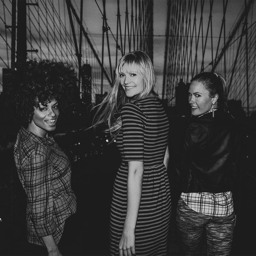
hey! images capture the first moment when you approach a friend. When you call him or her and they turn around and smile, happy to see you.




Graphic elements
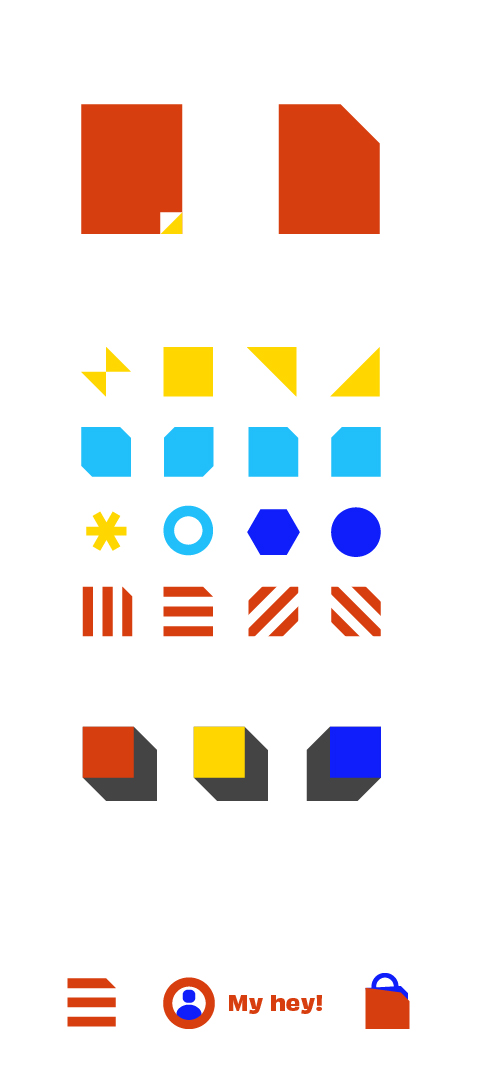
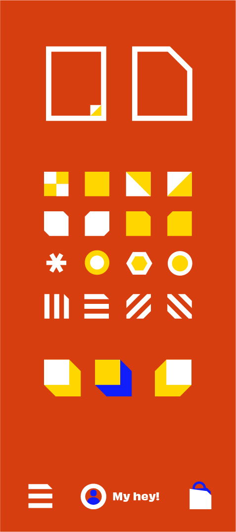
A group of small graphics elements have been designed to visually enrich supports such as the website.
Website
OOH & Press
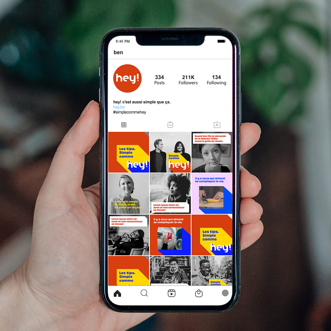
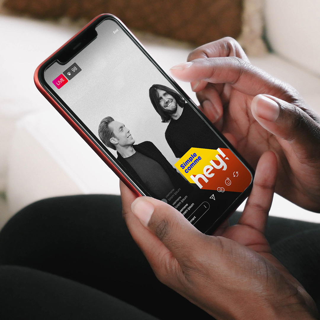
Social Media
Bannering
